z.tvrnr_
“Colour Me Better” – Editorial Redesign – College Assignment
February – April 2022
Description_
“Colour Me Better” is an article written for Nature.com by Alla Katsnelson, regarding accessible design in science visualisation imagery. It can be found here. This was a multistage college project focused on the stages of creating a print editorial piece, making it accessible, and then creating a digital counterpart which makes use of what we’d learned through our process to create a digital experience.
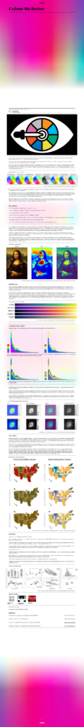
The print stage of the assignment was standard, the topic of my article is somewhat esoteric and lacks a lot of flavourful related imagery so for this piece I laid things out like a fairly standard book, this wasn’t particularly exciting and I knew that but frankly at this point my focus was on nailing the actual type part of the editorial and so I got my text laid out properly and focused on practicing that skill.
Using InDesigns internal tools, combined with a testing and editing in Acrobat made ensuring the pdf was accessible simple.
Finally was creating the digital experience, designed in adobe XD. First I spent some time going through the article and noting things I should emphasise, quotes were lacking, and so I found some images which gave context to the topics at hand, I designed mobile first for the sake of simplicity, and created a simple intro animation would begin as the title presented inaccessibly; as you scroll down (or click a button) the text and subtitle are revealed.
Inspiration_
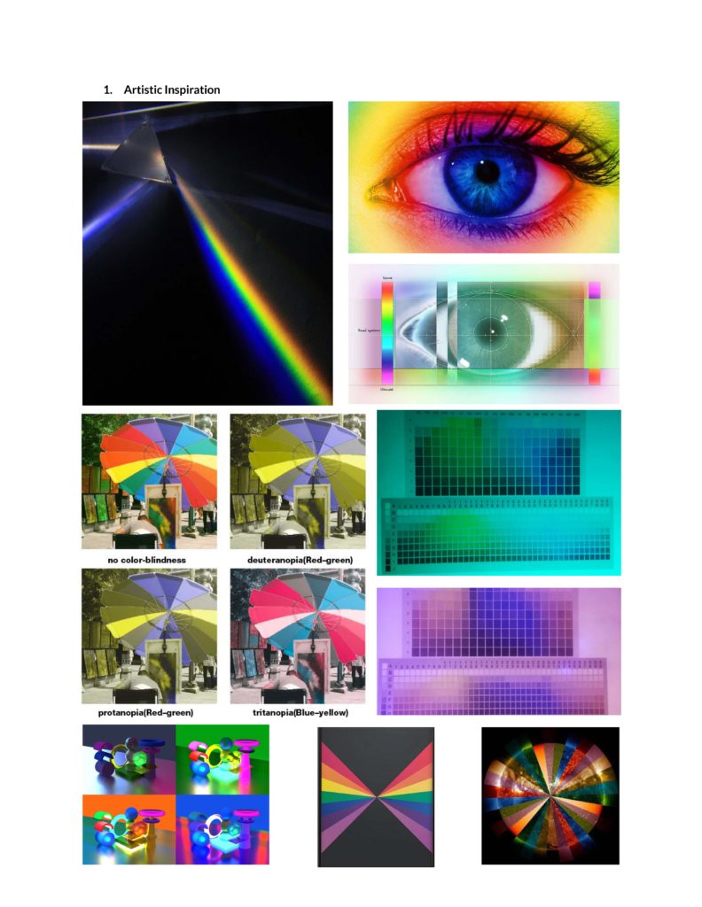
_Colour / Light Science
_Innovation through Accessibility
_Psychology / Cognition themes
Challenges_
_Scale Schematic Drawing
_Signage & Wayfinding Booklet Production
_Graphic Design
Process_
_Article Research
_Style Development
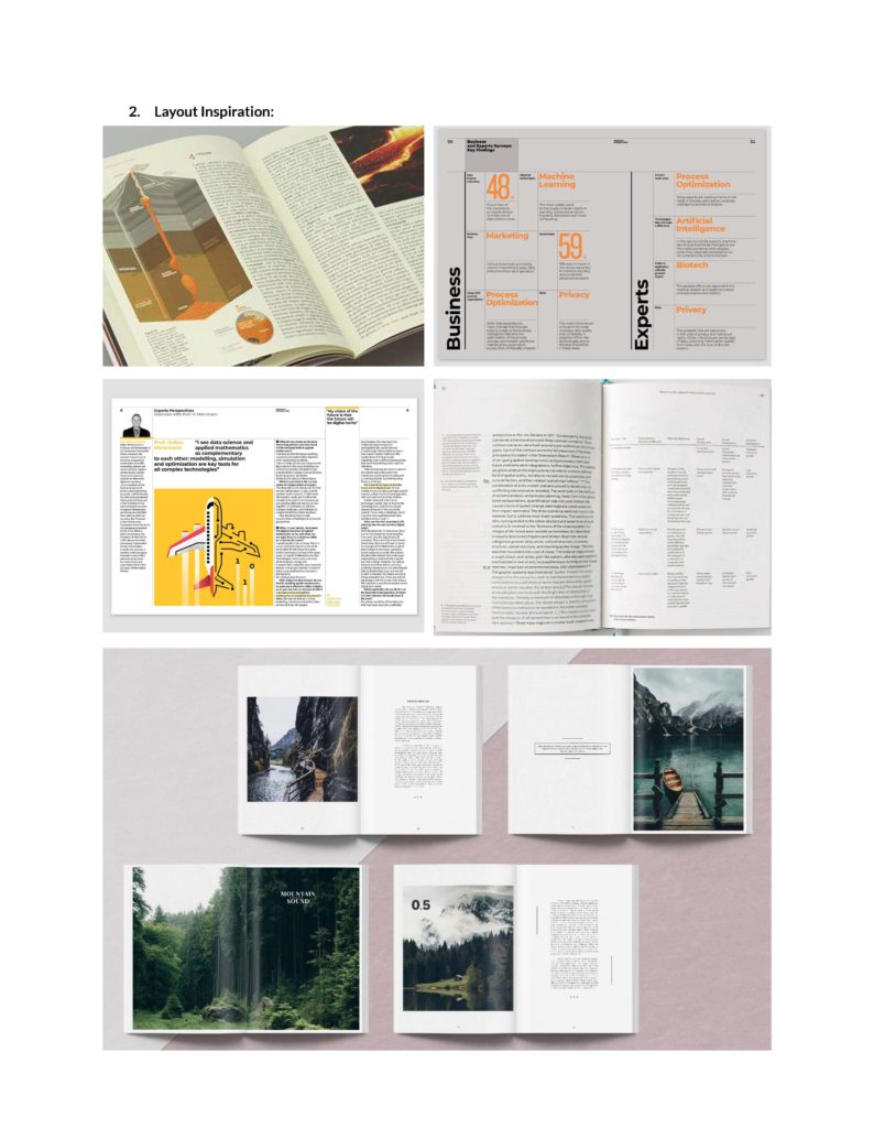
_Editorial Layout
_Digital Experience
Design Tool Used_
_Sketching
_Adobe Illustrator
_Adobe InDesign
_Adobe Acrobat
_Adobe XD
Fonts Used_
_Bennet Display Black
_Bennet Text Two
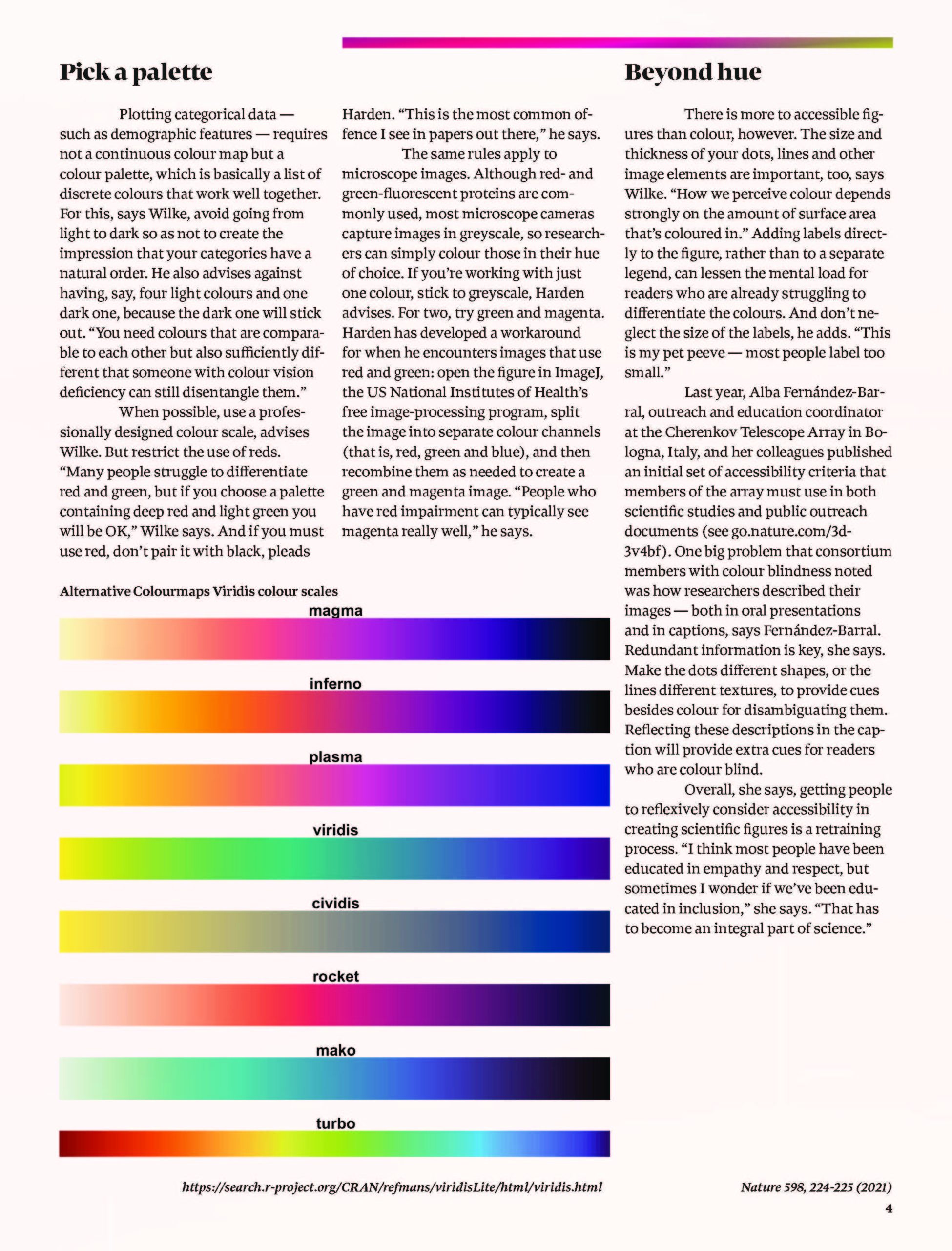
Print Editorial Design_
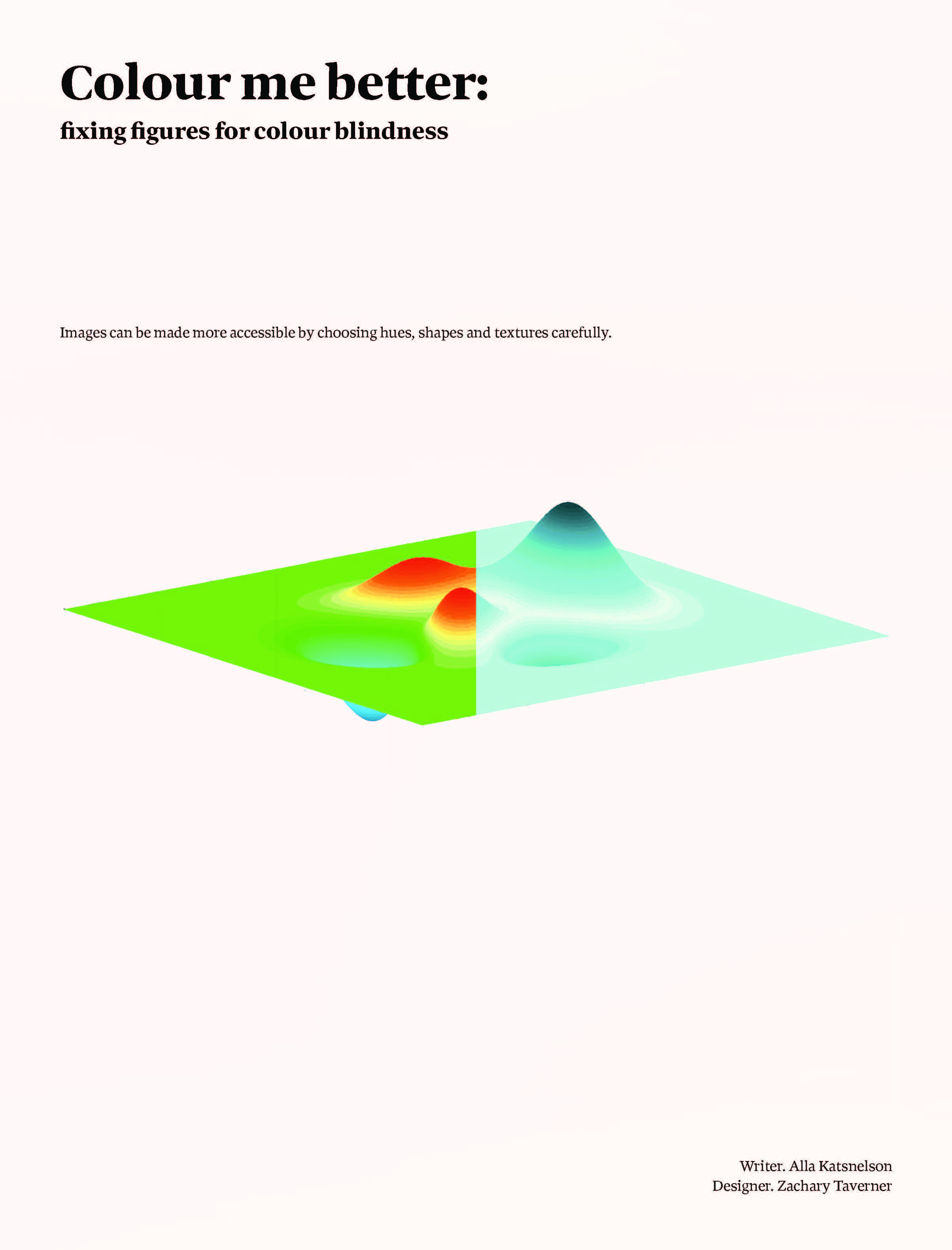
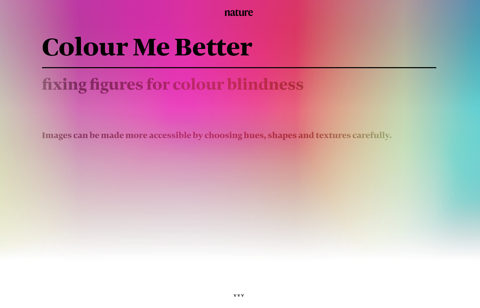
The article has been reformatted and redesigned as a print article for this project. Visuals have been added in order to show the colour palettes being described in an atmospheric way.
Design Rationale_
As the article is about accessibility regarding light, and working within that space, the intetional use of palettes and layouts allegorical to a colour blind experience, using “filters” may help the audience better understand how information and visuals can be obscured or simply made less legible by the condition.
In terms of visuals minimalism and simplicity are ideal as the article is fairly serious in tone and subject matter, and as the subject is primarily about scientific visuals, keeping that imagery as the main visual interest is of some importance.
Beyond keeping attention on the article’s purpose, imagery that I may use will be simple art referencing colour, eyes, and the light spectrum.
The font chosen Bennett, Bennett Display was used for headlines and Bennett Text Two was used for all else, my reasoning for this is that Bennett has a clean professional look.
In any kind of wellness or scientific design Futura or Nobel have sans serif deco styles. They have a clean, clinical, almost medical feeling, feeling advanced and technological.
For a full printed article focused on science communication a serif font is more fitting because it is easier to read for longer periods as well as hearkening back to the old- -school science communication most of us experienced through textbooks and CRT’s on plastic wheelie stands.
Bennet is a font that carries the smart design style of a font like Futura while maintaining the proper elegance and usability of a serif font.